Evaluation on Prezi
Wednesday, 16 March 2011
Evaluation
Our media product uses many forms and conventions of real media products such as the regular use of lip-syncing throughout the video. The lip-syncing is combined with the dancing in a majority of the areas to convey a real music video style, we combined the two to make sure the video had a variety of shots and was appealing to the audience.
We looked at Andrew Goodwin’s theory, and he indentifies a number of key features, which distinguish the music video as a form. He says that there is a relationship between the lyrics and the visuals. We have used this in our video for example when the lyrics say ‘I’ve got love for you’, we hold up a love heart when this lyric plays. We did this so that the audience can make and see the clear link between the song and the lyrics.
Another relationship he identifies is the one between the music and the visuals; we also applied this to our video when we used the keyboard when the song uses 2 beats together. We used keyboard because our chosen song was of the dance music genre and this is the kind of instrument that the audience would expect to see in a dance video.
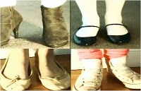
Goodwin says that intertextual references either to other music videos, film or TV, texts provide further gratification to pleasure the viewers and fans. We have incorporated intertextual references in our video when we looked at Madonna’s vogue video as our theme was 80’s and to inspiration and Kylies I should be so lucky and the mirror shot in our video. We also looked at a modern video by example and took inspiration of the tapping feet and fit this to our song. We took inspiration from the 80’s videos because our song was liked to the 80’s and we felt that this is what the audience would like to see and it would keep them entertained throughout.
He also that music videos are often constructed by the link between the visuals and the song plus the artist. I would agree that this is what our media products have been constructed of, as our visuals, song and artist are all linked and we use various shots of the artist and visuals that link in with the song and beats of the song, such as the rubix cube, tapping of the feat, then the lip syncing and close ups of the artist. This then links in with another thing Goodwin looks at as he says close us of the artists gives them representation and publicity they require.
Our media products are giving the artist publicity by creating an artist image amongst all the media products, including the video, digipack and advertisements. It is giving the artist publicity because people will recognise the digipack as there and the poster as theirs because we have used the same fonts and colours through out and kept the continuity.
Another theory we looked at when creating our music video was postmodernism. This is looking at old and the new coming together. I think we have used this well because we have taken inspiration from old music videos from the 80’s such as Madonna as this was the theme we were looking at due to our song choice being ‘acceptable in the 80’s’ and Madonna is a famous 80’s icon that people recognise and then we have looked at modern videos such as example as our song was a modern song.
Overall I think that our media products use, develop or challenge forms and conventions of real media products as we have used theories and technologies from actual music videos.
2. How effective is the combination of your main product and ancillary texts?
I think that our music video and ancillary tasks definitely work well together as we have tried to produce our own artist image by using similar colours and conventions through out. We have tried to keep continuity with our video, magazine advertisement and digipack.
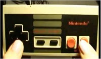
Our initial theme was going to be bright colours and things that link in with the 1980’s era, as our chosen song is ‘Acceptable in the 80’s’ by Calvin Harris. In our video we used bright flashing backgrounds to create an 80’s effect, so we have used the same colours in our digipack and magazine advertisement. I think that this works well because it helps with creating our artists image. We also thought about what type of objects where around in the 80’s, we thought about rubix cubes, Nintendo games, old records, converse and leg warmers, as we thought all of these could link in with this era. Luckily we could get hold of these objects and used them within our video, such as we have used the converse tapping along with the beat and we made it look as if the rubix cube was moving a long with the song, we also did this with a Nintendo controller and tried to make it look as if we were pressing the buttons along with the song. We also incorporated these images into our digipack and advertisement to keep the continuity. We have also included a pop art inspired image of lips in the corners of our ancillary tasks which I think gives of an 80’s vibe as it uses a bright colour for the lips on a black background. We have used the same images through out our over all media product because it helps the audience make a clear link between them and recognize the artist.
We have also used the same font in both the magazine advertisement and digipack because we felt that it had quite an 80’s era electro look to it as it was quite bold and square and had a kind of pixilated effect on it. We made the font white and put it on a black background to make it stand out to the audience and it it’s the first thing that the eye is drawn to, the black background of the writing also stands out from the brightly coloured main background, this will help the audience recognize the artist and also helps with creating the artists image.
Overall we think that the creativity and design of our main media product and ancillary texts have come together to form a good artist image and a good overall media product that have a clear link between them, we also think that our over all product would be attractive to our main target audience and stand out from other media products.
3. What have you learnt from your audience feedback?
To gather feedback we posted our music video on you tube, we felt this would allow us to collect a range of different opinions which would give us some constructive criticism on how we could improve it in the future if we were going to change certain areas as well as what worked better and was a strength for the video. As well we asked different people out of our target audience what they felt worked well and what they didn’t find as successful.
When asking both males and females what they thought of our music video they said that they thought that. (We recorded audience feedback here and used videos)
In our opinion the strengths of our music video were the quick flashes that we tried to keep in time with the different beats throughout the whole music video, as well as trying to use a variety of different shots from different angles throughout to make it appear more visually pleasing and eye catching for our chosen target audience. We tried different techniques throughout that would allow us to try and relate our work to the style, which you would expect to associate with a Calvin Harris music video e.g. bright colours and relating our theme back to the song title ‘Acceptable in the 80s’ by using props and costumes to try and portray this specific generation.
As a group we felt that the area that let our music video was the green screen as there were aspects that looked slightly pixilated therefore it wasn’t as successful as we would have originally liked. However we tried to improve this by choosing different backgrounds that wouldn’t highlight this weaker area as much. If I were to reshoot areas of this media product again I would try and ensure that the green screen was more accurate making the final outcome more visually pleasing throughout.
4. How did you use media technologies in the construction and research, planning and evaluation stages?
In our group we used media technologies throughout the construction and research, planning and evaluation stages. To start the construction and planning of our video we made another blog page on blogger.com for our A2 media portfolio. Having a blog meant that we could access our work through any computer and can even catch up on extra work at home. It also helped when organizing work and could keep track of deadlines. Blogger also enabled us to upload videos that were useful when it came to analyzing music videos of a similar type to our own. We could also upload Youtube video’s to our blog, which was good, when it came to analyzing and de-constructing different types of music videos. Social networking sites such as Facebook were also useful for producing feedback on our music video; we could then productively use our feedback in order to make our video better. Another social networking site which we used to prevent copyright laws from our artist Calvin Harris’s music was Myspace. We were able to send a message to Calvin Harris on his official Myspace Music page to ask for permission to use his song ‘Acceptable in the 80’s’. We used the website Prezi to present some of our work in the preparation stages, it is easier to view our work as a whole when being presented on a Prezi.. A way in which we were also able to view To produce our music video we had to use Final Cut. It is a lot more advance and complicated than the programme Imovie that we had previously used the year before. We had a Final Cut tutorial to help us with the cuts, transitions, motion paths, zooms and all the other various features that helped when making our music video. Although Final cut was a lot more complicated to use it also made our work look more professional and was easier for us to make it more appealing. Our music video was made up from many different layers to ensure our lip singing was in sync with the music to exact time. The media department provided us with Imacs to complete our video, we found that as a whole the macs were a lot faster and more technologically advance than a normal computer, which we used to our advantage. For a particular section of our video we used the green screen to get special effects in our video to make it look more advance and realistic. We had a green screen tutorial to help us when using some of the equipment. When using the green screen we used sony HDV cameras which gave us top quality footage. We had gained editing knowledge from our previous year in media studies. We used Photoshop to create our digipak and advertisement poster. We used the same bright vibrant colour scheme throughout all of our digipak so it looked more professional. It was difficult at first to get the accurate measurements for our design and the many different layers we had to build up because of all the 80’s theme photos on our design. But it was worth it in the end to have a design that looked professional and authentic. For our anamatic we used a Nikon D80 Camera to take photos of our shots and then upload them onto iMovie so we could then produce an anamatic of our music video. Finally we used a DV canon camera to record footage of our feedback from members of our class for the evaluation.
Digipack and Advertisment
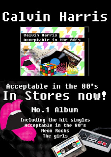
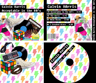
To make the digipack and advertisment i have used photoshop. To create the image which includes different things from the 80's including converse and a rubix cube i used the lasso tool and overlapped different layers. I used the same font which was called fixedsys on both of the media products because I thought it looked quite 80's as it had quite a pixelated look.
Screen grabs of making the digipack
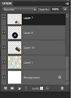
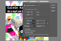
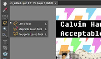
Screen grabs of making the digipack
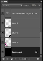
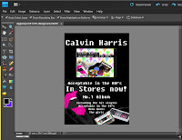
Tuesday, 15 March 2011
9 shot analysis of our music video
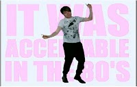 This shot was created using the green screen. We made a picture on photoshop, that matched the lyrics of the song. We used a bright vibrant colour scheme throughout all of our shots to keep them co-ordinated. A long shot of our main character is used and the flashing background makes him stand out more although he is wearing a white T-shirt.
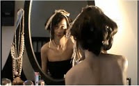
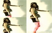 see a 3 framed shot of a dancing scene. The outfits used were key to create the right effect, in this shot we can see that bright tights and floral designs represent an old fashion. We used intense lighting to create a shadow on the white wall. The white wall then contrasts against the bright and vibrant costumes used.
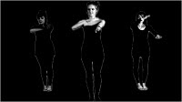 Another shot in our video which we created using the green screen is our own interpretation of the famous Vogue by Madonna video. This was famous throughout the 80's so we can use this shot to relate back to the song that we chose. We wore similar costume to the actual ones in the video and copied the dance routine step by step. There is minimal lighting in this scene to make it look more like the real thing.

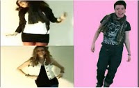 Here is one of the final shots. It shows our main character dancing with the pink background to contrast against him. And to the right is a split shot of two of us dancing wearing 80's style costume. It is a very busy shot with a variety of things going on we had also seen this been used previously in current music videos by popular artists.