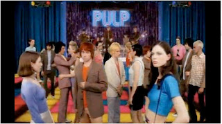
 0.02 - This is the first shot in the music video which is a wide shot of the setting. This is the main setting through out as it keeps going back to it. It is a kind of concert disco and looks as if its in a kind of hall. It also has the band being the band in the video. The first thing I notice about the mise en scene in this video is that it is quite colourful as all the actors are dressed in colourful clothes and the decoration is also quite colourful. I think this link with the song title with a contrast because the song is called 'Common People' which makes you think of everyday people but then all the actors are quite colourful which could represent common people with colourful personalities. I don't think this video has much of a story line or a narrative but it still links with the song however the lyrics cannot match the video in this section as it is only the introduction to the song so far.
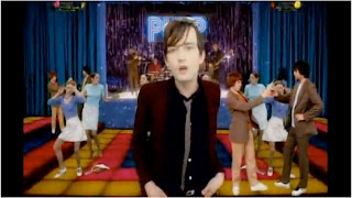 0.09 - This is the shot when the singer of the band first appears into the video and the lyrics in the song start. I think this would be self-reflexive because the singer of the band is in the video and then the band is also in the background playing at the party/disco. It is still the same shot just with the singer in singing along to the song. It still has a colourful mise en scene.
 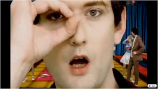 0.18 - This is a meat shot of the singers face. This links with the lyrics well because it says 'Thats were I caught her eye' and he points out his eye and puts his finger round it so it has a close up shot of his face to show this. You can still see that he is in the same surroundings at the party with the people in the background and the brightly coloured floor. It looks quite 70's in a disco era and peoples costumes remind me of 70's fashion. For example in this shot their is a man wearing a brown suit with flared trousers.
 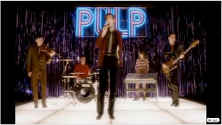 0.23 - This is the first shot of the band playing in the background which is the actual band which again is self-reflexive as it is the actual band playing in the narrative of the video. It is quite a low shot, looking up at the band. This could be as if the veiwers of the video are in the audience. The band are stood in the posiation bands usually stand in with the front man at the front. The back drop for the band is quite tacky with purple streamers which reminds me of a disco in a kind of school hall which could then again link in with the song called 'Common People'
0.37 - This the first shot of the two people singing. This links to the song because when the front man is singing, the lyrics are asif he is another girl saying something. Therefore he has brought a girl in to sing to this part. However it is not the girls voice it is still the front mans voice which can be quite weird. They are still in the same setting with the gig/disco in the background which seems to be the common setting through out the video.
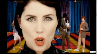 0.44 This is a meat shot of the girl lipsyncing to the front mans voice. It is still in the same setting as you can see behind and it matches the meat shot of the lead singer.
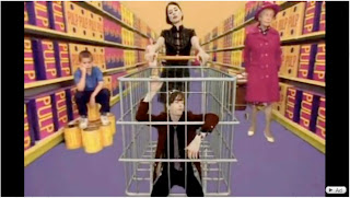
1.08 - This is the shot of the main man and women in a super market. I think this links in with the song because it is called 'Common People' and how people use super markets in everyday life making them common. I have also notices that all the products in the background have 'Pulp' written on them which is like they are advertising the band. Their is also an old women in the background showing that the super market is a everyday places where common people shop. The colours are still quite bright in this shot which again matches the mise en scene of the other shots.
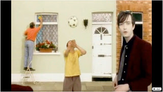
1.30 - This shot also links in with the song title as it shows 'Common People' getting on with everyday life in a kind of common street with terraced housing. It shows people cleaning windows and playing with a football which could be class as common things to do. This also links in with the lyrics when this shot appears as it says 'You want to live like common people' which then it shows common street houses and people getting on with everyday life.

1.38 - This is a shot on the same common street with terraced houses showing someone taking a TV from someone's house and climbing out the window. This could link in with the bad side of common life and common people and shows things that happen in everyday life as well as people cleaning windows. These shots look as they are on a kind on conveyer belt going round and round and shows the main singer in the shot more than once which I think looks quite effective and clever because it looks as if it is someone just going a long a street but still has the singer lip syncing the song.
