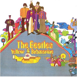
I have chosen The Beatles album cover the Yellow Submarine to analyze.
The images on the front are quite colourful and all cartoon. This could represent a happy, joyful track-list which from listening to 'Yellow Submarine' it is. The Album was released during 1969 during quite a psychedelic stage which I think is shown in the album cover with its bright colours. The images in the background are quite weird and have quit strange shapes. It is well known that The Beatles experimented with drugs quite a lot which I think could also be portrayed the images in the background. Their is 2 apples in the background which links to the record label that they were with at this time which was called apple, therefore linking the two together, and also could be advertising the company. In the bottom right hand corner it shows 4 people playing big brass instruments which also links to the music on the album as some of the songs or 'Side B' as it was on record were all quite big band musical songs with no lyrics. This image could be portraying that side of the album. The most obvious image on this front cover would be the yellow submarine, obviously because it matches with the album cover.
The text on this album is in yellow, to match the the album titles and kind of looks like you are seeing double when looking at it as it looks like 2 titles have been layered on top of each other. This could also link into the drugs that the beatles were experimenting with at the time and the psychedelic era. This is the only text on the whole of the front cover which draws your eyes in and you can see that it is an album by The Beatles quite easily and see that is is 'Yellow Submarine', it is also quite central underneath a a cartoon image of the beatles, so people know who has released the album.
The Beatles created quite happy pop music at the time and were one of the biggest bands around and I think the pop cultural happy music is portrayed in the album cover as it is quite brightly coloured which would not really be suitable for a heavy metal band or rap.
I think that this album cover will have been aimed at the younger generation with its bright colours and images. The images are also all cartoon and quite naive which I do not think would have appealed to the older generation in this decade.
Overall I think that this album cover is quite good and definitely portrays what The Beatles were trying to portray in this time and I think it would definitely advertise the album cover and makes it clear what it is called and who it is by, which will have been important at the time as they were one of the most popular bands around and would want people to recognize the album as theirs and want to buy it.
No comments:
Post a Comment