Tuesday, 23 November 2010
Thursday, 21 October 2010
Tuesday, 12 October 2010
Risk Assesment
For health and safety reasons our group came up with some ideas
to reduce any risks whilst filming :
Possible Risks
1. Trailing wires
2. Slippery floor
3. Possible over-heated machinery
4. Sharp objects on the floor when walking around in bare feet
5. Broken equipment
6.Unavailable actors
How we could solve them?
1.Cable ties and covers
2. Make sure set is well prepared
3. Set up regular ventilation
4. To make sure the floor has been safely checked
5. Replace any broken equipment or try and solve the problem or find away around it.
6. The main actors in our video are ourselves to we need to make sure that we are all defiantly
available to film when planned.
Thursday, 7 October 2010
Test shots of Artist Logo
Wednesday, 22 September 2010
Background to our chosen song
Acceptable in the 80s" is a 2007 song by electronic musician Calvin Harris The video is about the style and culture of the 1980s.
The music video follows typical conventions of the 80's, it includes a lot of bright colours and big hairstyles which were high in fashion during this time. The video also contains 2 scientists testing on an animal which may think to the fact animal testing was 'acceptable in the 80's' which is is not today.
Acceptable in the 80's was released in 2006 on maxi single, the same year it was recorded and on the 12th of march 2007 in the UK and March 15th in the USA. The song became Calvin's first hit in the UK as it went to number 10 in the UK singles chart. The radio edit was 3.31 seconds long and the recording label was Sony/Columbia. Other songs released by Calvin Harris during 2007 were 'Vegas' and 'The Girls'. All of these songs were released as part of Calvin's first album 'I Created Disco'. The album title links with the genre as music as it can sometimes be described as 'Disco' or 'Dance'.
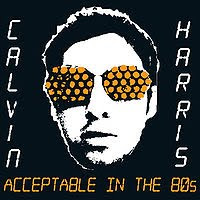
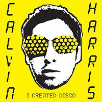
Calvin Harris single cover.
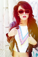
This image shows what kind of costume and bright colours we will be using.
Our music video's overall style is edgy with strong bold colours using costume and music to portray this. We are going to dress ourselves up to look like the 80's icons, including madonna and blondie this allows us to continue to relate back to the song title. Each costume and make-up will relate back to their over the top personalities. The focal point of bold colours and prints is aimed to capture our audiences attention. We intend to use keyboards and headphones as part of our props, and relate this to the beat and timing of the music, making our video to a more professional standard and will appeal to our target audience. We are hoping to find somewhere with a plain white background to shoot our video for particular scenes as our bold bright 80's style music and costume would contrast against the plain minimalist background. We hope to use the 'WE LOVE 80'S' throughout as this is relating back to the theme of the song making it more realistic. For our performance we are a group of three girls and as the artist we have chosen, 'Calvin Harris' is a male artist we thought it was extremely relevant that we added a male actor to play his part. We are only adding one actor, minus ourselves as we felt this would minimalise complications and make our product easier to film.
Some of the ideas which we have finalized include:
'I've got love for you, if you were born in the 80's, the 80's' - For this lyric our initial ideas where to include a mixture of medium, close-up and long shots all connecting vertically together this will give our audience a sense of illusion and make them want to watch on.
The music video follows typical conventions of the 80's, it includes a lot of bright colours and big hairstyles which were high in fashion during this time. The video also contains 2 scientists testing on an animal which may think to the fact animal testing was 'acceptable in the 80's' which is is not today.
Acceptable in the 80's was released in 2006 on maxi single, the same year it was recorded and on the 12th of march 2007 in the UK and March 15th in the USA. The song became Calvin's first hit in the UK as it went to number 10 in the UK singles chart. The radio edit was 3.31 seconds long and the recording label was Sony/Columbia. Other songs released by Calvin Harris during 2007 were 'Vegas' and 'The Girls'. All of these songs were released as part of Calvin's first album 'I Created Disco'. The album title links with the genre as music as it can sometimes be described as 'Disco' or 'Dance'.


Calvin Harris single cover.

This image shows what kind of costume and bright colours we will be using.
Our music video's overall style is edgy with strong bold colours using costume and music to portray this. We are going to dress ourselves up to look like the 80's icons, including madonna and blondie this allows us to continue to relate back to the song title. Each costume and make-up will relate back to their over the top personalities. The focal point of bold colours and prints is aimed to capture our audiences attention. We intend to use keyboards and headphones as part of our props, and relate this to the beat and timing of the music, making our video to a more professional standard and will appeal to our target audience. We are hoping to find somewhere with a plain white background to shoot our video for particular scenes as our bold bright 80's style music and costume would contrast against the plain minimalist background. We hope to use the 'WE LOVE 80'S' throughout as this is relating back to the theme of the song making it more realistic. For our performance we are a group of three girls and as the artist we have chosen, 'Calvin Harris' is a male artist we thought it was extremely relevant that we added a male actor to play his part. We are only adding one actor, minus ourselves as we felt this would minimalise complications and make our product easier to film.
Some of the ideas which we have finalized include:
'I've got love for you, if you were born in the 80's, the 80's' - For this lyric our initial ideas where to include a mixture of medium, close-up and long shots all connecting vertically together this will give our audience a sense of illusion and make them want to watch on.
Questionnaire
1.How old are you?
-Under 16
-16 - 18
-18 +
The majority of people who answered the questionnaires had the average age of 16 - 18, as those are the age of people who attend the college or in the late stages of school.
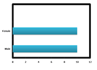
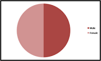
2.Gender: male or female?
-50/50
When collecting research we made sure that there was a mixture of both genders so we could establish fully what gender would prefer the specific genres of music. We asked 10 males and 10 females.
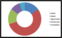
3.Occupation:
-school
-college studying as/a levels
-apprenticeship
-full time job
-unemployed
Through researching the occupation of our target audience we found that more than half were at college studying A/AS levels at college.
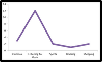
4. What do you do in your spare time?
There where a range of different activities that we found when researching, although listening to music we found had the highest amount. This allows us to be able to ask further questions in more detail and help us towards the end result.
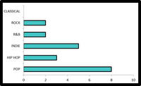
5. Favourite genre of music?
-Pop
-Hip Hop
-Indie
-R&B
-Rock
-Classical
-Other
We found that POP was the favourite type of music genre amongst our target audience.
6. Do you think that the music video important to every song?
-Yes/No
Almost all said that the music video was important for the song to be a success, as they felt it made the song stand out more.

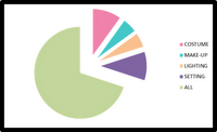
7. What key features do u feel allows the video to stand out?
-Props
-Costumes
-Make up
-Lighting
_Location/Setting
-All
The majority of our audience felt that all features were as important as each other as they all contribute to the overall factor of the music video ensuring it is visually pleasing.
8.How often do you listen to music?
-All the time
-Daily
-Weekly
-Monthly
We found that after looking at all our results that they listen to music all the time and they listen to it a few hours everyday at least.

-Under 16
-16 - 18
-18 +
The majority of people who answered the questionnaires had the average age of 16 - 18, as those are the age of people who attend the college or in the late stages of school.

2.Gender: male or female?
-50/50
When collecting research we made sure that there was a mixture of both genders so we could establish fully what gender would prefer the specific genres of music. We asked 10 males and 10 females.

3.Occupation:
-school
-college studying as/a levels
-apprenticeship
-full time job
-unemployed
Through researching the occupation of our target audience we found that more than half were at college studying A/AS levels at college.

4. What do you do in your spare time?
There where a range of different activities that we found when researching, although listening to music we found had the highest amount. This allows us to be able to ask further questions in more detail and help us towards the end result.

5. Favourite genre of music?
-Pop
-Hip Hop
-Indie
-R&B
-Rock
-Classical
-Other
We found that POP was the favourite type of music genre amongst our target audience.

6. Do you think that the music video important to every song?
-Yes/No
Almost all said that the music video was important for the song to be a success, as they felt it made the song stand out more.

7. What key features do u feel allows the video to stand out?
-Props
-Costumes
-Make up
-Lighting
_Location/Setting
-All
The majority of our audience felt that all features were as important as each other as they all contribute to the overall factor of the music video ensuring it is visually pleasing.

8.How often do you listen to music?
-All the time
-Daily
-Weekly
-Monthly
We found that after looking at all our results that they listen to music all the time and they listen to it a few hours everyday at least.

Tuesday, 21 September 2010
Lyric Breakdown
Intro (0.00-0.31)
It was acceptable in the 80's (0.31-0.37)
It was acceptable at the time (0.39-0.44)
It was acceptable in the 80's (0.46-0.52)
It was acceptable at the time (0.54-0.59)
I've got love for you (1.00-1.02)
If you were born in the 80's, the 80's (1.02-1.07)
I've got hugs for you (1.08-1.10)
If you were born in the 80's, the 80's (1.10-1.14)
I'll do things for you (1.15-1.17)
If you were born in the 80's, the 80's (1.17-1.22)
I've got hugs for you (1.23-1.26)
If you were born in the 80's (1.26-1.29)
Yeah (1.29-1.30)
It was acceptable in the 80's (1.33-1.39)
It was acceptable at the time (1.40-1.46)
It was acceptable in the 80's (1.48-1.54)
It was acceptable at the time (1.55-2.00)
Instrumental (2.00-2.16)
I've got love for you (2.17-1.18)
If you were born in the 80's, the 80's (2.18-2.23)
I've got hugs for you (2.24-2.26)
If you were born in the 80's, the 80's (2.26-2.30)
I'll do things for you (2.32-2.33)
If you were born in the 80's, the 80's (2.33-2.38)
I've got hugs for you (2.39-2.41)
If you were born in the 80's (2.41-2.44)
Yeah (2.44-2.45)
It was acceptable in the 80's (2.48-2.54))
It was acceptable at the time (2.55-3.01)
It was acceptable in the 80's (3.03-3.09)
It was acceptable at the time (3.10-3.15)
Instrumental (3.15-3.32)
Finish
Development of Initial Ideas
Our chosen target audience would about around 15 to 24, which would be around the age of students. I am judging the age rage on the genre of music I am itending to use for my video; Electro pop/Dance.
Ideas for our video includes using bright colours and 80's themed costumes and make up. We also had the idea of having 80's icon references through out the video. For example people like Madonna and Blondie. If possible we were going to try and use clever lighting to match the beat of the song.
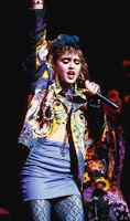

These images show what kind of costume we are going to use in our video as they are 80's icons and we are taking inspiration from them.
Ideas for our video includes using bright colours and 80's themed costumes and make up. We also had the idea of having 80's icon references through out the video. For example people like Madonna and Blondie. If possible we were going to try and use clever lighting to match the beat of the song.


These images show what kind of costume we are going to use in our video as they are 80's icons and we are taking inspiration from them.
Thursday, 16 September 2010
Genre and convention Research
We have chosen the song 'Acceptable in the 80's by Calvin Harris. The genre of Calvin's music would often be classed as Electropop, Electro house or Nu-Disco. It is usually quite upbeat and quick paced. Typical Instruments used are usually Synthesizer, Vocals, Drum machine, Tape loops, Drums, Guitar, Keyboard. Typical conventions videos of this genre use are bright colours and flashing lights. The images in the videos usually match the beats of the song. They usually include dancing as the music is quite quick and sometimes classed as 'Dance Music'.
An example of this would be the artist example.
The video also includes a lot of shots of the artist and then back to the audience to show that they are having a good time.
An example of this would be the artist example.
The video also includes a lot of shots of the artist and then back to the audience to show that they are having a good time.
Permission email
Thursday, 9 September 2010
Thursday, 15 July 2010
Magazine Advertisement
 The first thing I noticed when looking at this album magazine advertisement was the Title of the band as it is at the top of the page and in red when most of the advertisement is in black and white. The title they have used i would say would be the band motif because they always use the same font and it is usually associated with The Beatles. There is then an image of The Beatles underneath the title to simple show who the artist is, the image is in black and white so that the title and the album covers at the bottom stand out more. The text explaining the advertisement is also in black to stand out against the white background. 'IN STORE NOW' is in capitals to draw the eye to the audience to let them know when they can purchase the albums. The albums at the bottom of the page are also in colour to stand out and the record company labels, such as apple are also in colour maybe to advertise them.
Wednesday, 30 June 2010
9 Shots Music Video
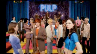 0.02 - This is the first shot in the music video which is a wide shot of the setting. This is the main setting through out as it keeps going back to it. It is a kind of concert disco and looks as if its in a kind of hall. It also has the band being the band in the video. The first thing I notice about the mise en scene in this video is that it is quite colourful as all the actors are dressed in colourful clothes and the decoration is also quite colourful. I think this link with the song title with a contrast because the song is called 'Common People' which makes you think of everyday people but then all the actors are quite colourful which could represent common people with colourful personalities. I don't think this video has much of a story line or a narrative but it still links with the song however the lyrics cannot match the video in this section as it is only the introduction to the song so far.
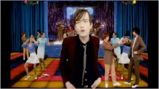 0.09 - This is the shot when the singer of the band first appears into the video and the lyrics in the song start. I think this would be self-reflexive because the singer of the band is in the video and then the band is also in the background playing at the party/disco. It is still the same shot just with the singer in singing along to the song. It still has a colourful mise en scene.
 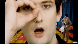 0.18 - This is a meat shot of the singers face. This links with the lyrics well because it says 'Thats were I caught her eye' and he points out his eye and puts his finger round it so it has a close up shot of his face to show this. You can still see that he is in the same surroundings at the party with the people in the background and the brightly coloured floor. It looks quite 70's in a disco era and peoples costumes remind me of 70's fashion. For example in this shot their is a man wearing a brown suit with flared trousers.
 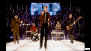 0.23 - This is the first shot of the band playing in the background which is the actual band which again is self-reflexive as it is the actual band playing in the narrative of the video. It is quite a low shot, looking up at the band. This could be as if the veiwers of the video are in the audience. The band are stood in the posiation bands usually stand in with the front man at the front. The back drop for the band is quite tacky with purple streamers which reminds me of a disco in a kind of school hall which could then again link in with the song called 'Common People'
0.37 - This the first shot of the two people singing. This links to the song because when the front man is singing, the lyrics are asif he is another girl saying something. Therefore he has brought a girl in to sing to this part. However it is not the girls voice it is still the front mans voice which can be quite weird. They are still in the same setting with the gig/disco in the background which seems to be the common setting through out the video.
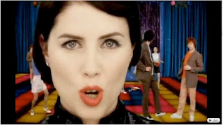 0.44 This is a meat shot of the girl lipsyncing to the front mans voice. It is still in the same setting as you can see behind and it matches the meat shot of the lead singer.
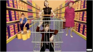
1.08 - This is the shot of the main man and women in a super market. I think this links in with the song because it is called 'Common People' and how people use super markets in everyday life making them common. I have also notices that all the products in the background have 'Pulp' written on them which is like they are advertising the band. Their is also an old women in the background showing that the super market is a everyday places where common people shop. The colours are still quite bright in this shot which again matches the mise en scene of the other shots.
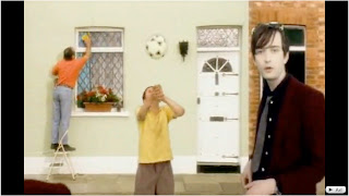
1.30 - This shot also links in with the song title as it shows 'Common People' getting on with everyday life in a kind of common street with terraced housing. It shows people cleaning windows and playing with a football which could be class as common things to do. This also links in with the lyrics when this shot appears as it says 'You want to live like common people' which then it shows common street houses and people getting on with everyday life.

1.38 - This is a shot on the same common street with terraced houses showing someone taking a TV from someone's house and climbing out the window. This could link in with the bad side of common life and common people and shows things that happen in everyday life as well as people cleaning windows. These shots look as they are on a kind on conveyer belt going round and round and shows the main singer in the shot more than once which I think looks quite effective and clever because it looks as if it is someone just going a long a street but still has the singer lip syncing the song.
Music Video Shots
I have looked at this music video and counted the different shots and I got approximately 130 shots. When the song was more fast paced the shots became shorter and quicker and when the song slowed down in pace there were less shots and they lasted a longer duration of time. In the slower parts of the song the shots seem to have a smooth transition between each other and when the song speeds up it is more jumpy and quick. The video uses a lot of meat shots, I think this would be because the video does not really have a story line or any narrative so it shows the singer singing most of the song. It also shows the emotion in her face making her look quite passionate about the song. When watching the video I think that it would be classed as amplification as the beats seem to match the song by speeding up when the song speeds up, and some of the lyrics match the video, for example when she mentioned 'in the dark' she seems to be in the dark
Tuesday, 29 June 2010
Lip Sync Task
We created a Lip Sync to get used to the software we will be using, called final cut and to practice Lip syncing the song to the footage. To create this we needed to film someone lip syncing to a song, We found it was easier for our actor to actually sing the song because it would be easier to get the track accurate to the lip movements. When we had imported the footage we then imported the track. We had shot our actor in different places so we had to find the shot which matched the song lyrics. We then fit them to the song and cut out the parts of the song we didn't use.
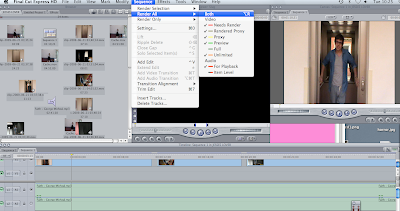
This is a print screen of us editing our lip sync video using final cut.
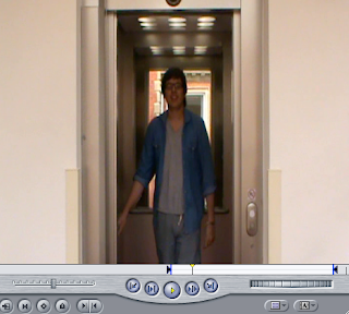
This is a screen shot of what we could see while using final cut. To get the right shot for the music we used the in and out markers.
Tuesday, 22 June 2010
Album Cover Analysis
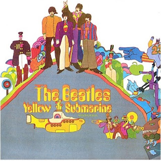
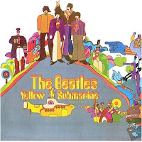
I have chosen The Beatles album cover the Yellow Submarine to analyze.
The images on the front are quite colourful and all cartoon. This could represent a happy, joyful track-list which from listening to 'Yellow Submarine' it is. The Album was released during 1969 during quite a psychedelic stage which I think is shown in the album cover with its bright colours. The images in the background are quite weird and have quit strange shapes. It is well known that The Beatles experimented with drugs quite a lot which I think could also be portrayed the images in the background. Their is 2 apples in the background which links to the record label that they were with at this time which was called apple, therefore linking the two together, and also could be advertising the company. In the bottom right hand corner it shows 4 people playing big brass instruments which also links to the music on the album as some of the songs or 'Side B' as it was on record were all quite big band musical songs with no lyrics. This image could be portraying that side of the album. The most obvious image on this front cover would be the yellow submarine, obviously because it matches with the album cover.
The text on this album is in yellow, to match the the album titles and kind of looks like you are seeing double when looking at it as it looks like 2 titles have been layered on top of each other. This could also link into the drugs that the beatles were experimenting with at the time and the psychedelic era. This is the only text on the whole of the front cover which draws your eyes in and you can see that it is an album by The Beatles quite easily and see that is is 'Yellow Submarine', it is also quite central underneath a a cartoon image of the beatles, so people know who has released the album.
The Beatles created quite happy pop music at the time and were one of the biggest bands around and I think the pop cultural happy music is portrayed in the album cover as it is quite brightly coloured which would not really be suitable for a heavy metal band or rap.
I think that this album cover will have been aimed at the younger generation with its bright colours and images. The images are also all cartoon and quite naive which I do not think would have appealed to the older generation in this decade.
Overall I think that this album cover is quite good and definitely portrays what The Beatles were trying to portray in this time and I think it would definitely advertise the album cover and makes it clear what it is called and who it is by, which will have been important at the time as they were one of the most popular bands around and would want people to recognize the album as theirs and want to buy it.
Monday, 21 June 2010
Album Cover

The album covers I have chosen to look at all have quite a lot of common features. For example they all use bright colours and cartoon images to portray their music.
The first thing i noticed about all of the album covers I had chosen would be that they all are quite colourful and bright and all use cartoon images. This could be portraying the kind of music that each album has. For example this is Paolo Nutini's second album and his music style has slightly changed and is more upbeat compared to his first alum and I think he is trying to portray this thought the cover with the happy bright colours, the eggs are 'sunny side up ' which matches the album title. Their is a rainbow and balloons
in the background and a peace sign and love heart drawn onto the wall, which could link with The Beatles Psychedelic era with peace and love. Mika's album cover is happy and colourful also to po
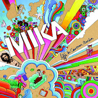
rtray hi
s music as he is also quite upbeat and cheerful music linking in with The Beatles, Yellow Submarine which was made during a psychedelic time in the 1960's, again portraying the kind of music that the artists are creating.
Another feature these
album covers have in common would be that they all show the artists name and the title of the album. This will be because they are all very well known artists
and want the audience to know that this is their album so people buy it.
The titles are quite large, making it stand out to the audience for example the Mika title stands out because it is in big block capitals in white which stands out in front of the col
ourful background.
All of the album covers don't have a photographic image of the artists on the album covers, this could also be to do with the happy upbeat music and the cartoon images make the album covers quite fun and quirky to match the music
style.
Thursday, 27 May 2010
Warhol
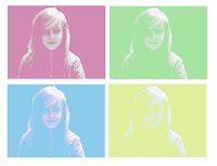
This is another Warhol image I tried that he uses in his art work. To create this I cut out the main body and deleted the background and filled it with a colour. I then made the image blurry like i did when creating my first Warhol. I made the image as blurry as I thought was needed. I then replaces the colours in the images. I then repeated this 4 times and created my final product. Warhol did this kind of work on the famous Marilyn Monroe image. When was first creating this I forgot to take out the background image and create a block colour. I deleted this and took out the background to make a block colour.

(Wrong Image)
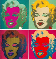
(Marilyn Monroe Andy Warhol Image)
Warhol

After creating an Opie image, I then created Warhol Image. To do this I again used different layers and fill techniques to create this. I first put my chosen image in greyscale and adjusted the brightness and contrast. I then created a duplicate image and made the image blurry. I then made another layer and filled it with colour using the paint bucket tool. An artist that has used this would be The Velvet Underground. Warhol designed their album cover for them and used similar techniques.
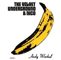
(The Velvet Underground and Nico Album Cover)
Opie
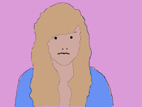
This is my Opie image of myself that i created on photoshop. It started with an original image and i created different layers to produce the final product. To select the parts of the image I wanted to change and create a layer for I would use the Marquee selection tool to draw round it. I did this for my face hair and clothes and I named each layer so I didn't get confused in the process. I would then choose a suitable colour and then simply just used the paint bucket tool to fill in age layer, like my hair etc. I used the pencil tool to create eyes, nose and a mouth. Lastly I created a layer for the block background colour and just filled it in used the pain bucket tool. We got the inspiration to create the Opie images after looking at the Blur album cover off all the members of the band in this style.
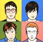
(Blur Album Cover)
Subscribe to:
Comments (Atom)


